How to Create CSS Animate Button
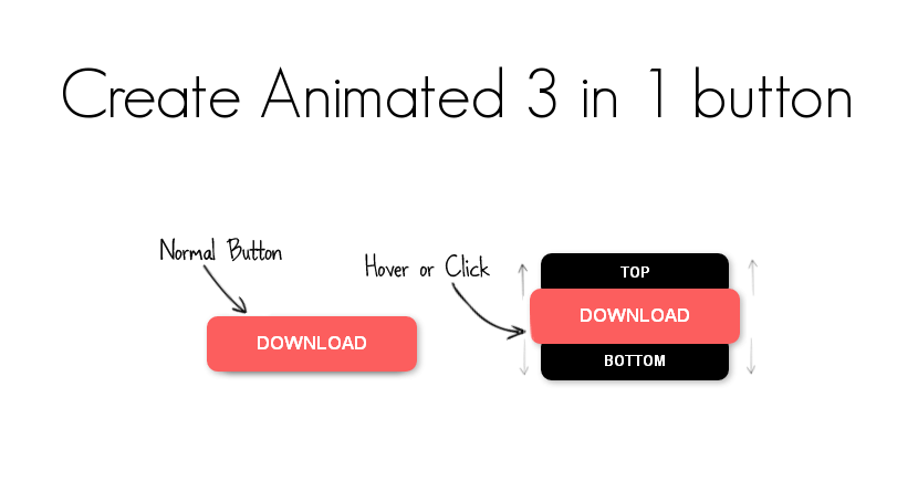
In this post, you learn simple 3 in 1 CSS animate button using CSS properties. I will show you here some CSS techniques that you use to create the CSS animate button easily. So let’s start how to create CSS animate button using CSS.
Using HTML and CSS, we create three buttons. One is the main button, and another two is top and bottom button are little smaller. Little smaller top and bottom button hidden under the main button. When the hover effect occurs, top and bottom buttons slide up and slide down to show all 3 buttons. And, when hovering out, it will be hidden under the main button.
HTML Code
We need to write a one div element for the wrapper. Add a class attribute value “button”. Inside div element adds 3 span elements and assigns class attributes values “main”, “top” and “button”.
<div class="button">
    <span class="main"><a href="#">Download</a></span>
    <span class="top"><a href="#">TOP</a></span>
    <span class="bottom"><a href="#">Bottom</a></span>
</div>
CSS Code
Here a CSS Styles to apply on button. Here we set main button height, width, background color. And all three buttons displayed in block style.
span.main a {
    display: block;
    width: 190px;
    height: 50px;
    text-align: center;
    color: #FFF;
    background: #FC5E5E;
    font: bold 17px/50px Arial;
    text-decoration: none;
    text-transform: uppercase;
}
Same way we are creating another two top and bottom button. However z-index property value set to -1 in this two button. z-index property work only when the position value absolute. So we have to set position and z-index properties following two buttons.
span.top a {
    display: block;
    position: absolute;
    z-index: -1;
    width: 170px;
    height: 40px;
    background: #000;
    color: #FFF;
    margin: -40px 0 0 10px;
    font: bold 13px/35px Arial;
    text-decoration: none;
    text-transform: uppercase;
    text-align: center;
}
span.bottom a{
    display: block;
    position: absolute;
    z-index: -1;
    width: 170px;
    height: 40px;
    background: #000;
    color: #FFF;
    margin: -45px 0 0 10px;
    font: bold 13px/45px Arial;
    text-decoration: none;
    text-transform: uppercase;
    text-align: center;
}
Next, we have use transition properties for a slip-up top button, and slip-down bottom button.
transition: margin 0.5s ease;
-webkit-transition: margin 0.5s ease;
-moz-transition: margin 0.5s ease;
-o-transition: margin 0.5s ease;
-ms-transition: margin 0.5s ease;
These 3 button looks plain formal, so we add the box-shadow effect, and make button border rounded.
div.button span a {
    border-radius: 10px;
    box-shadow: 2px 2px 8px rgba(0,0,0,0.3);
    -webkit-border-radius: 10px;
    -webkit-box-shadow: 2px 2px 8px rgba(0,0,0,0.3);
    -moz-border-radius: 10px;
    -moz-box-shadow: 2px 2px 8px rgba(0,0,0,0.3);
}
Button almost designed. We need to add a hover effect of the top and bottom button when slip up and slip down.
/* HOVER */
.button:hover span.top a{
    margin: -82px 0 0 10px;
}
.button:hover span.bottom a{
    margin: -7px 0 0 10px;
}
Buttons are a slip-up and slip-down perfectly but when mouse hover out in this top or bottom button. It’ll automatic both buttons go back to the original position. So for that, we need to set some margin same as hover effect we set. All three button when active, we do not know this is really active or not, so we need to add a background color.
/* active */
.button a:active {
    background: #FB4C4C;
}
.button:active span.top a{
    margin: -82px 0 0 10px;
}
.button:active span.bottom a{
    margin: -7px 0 0 10px
}Conclusion
Above we create an animated button using CSS3 properties. It is easy to use anywhere on the website. As a result, you do not need to create a flash button.
If you like our article, please consider buying a coffee for us.
Thanks for your support!
 Buy me a coffee!
Join the Discussion.