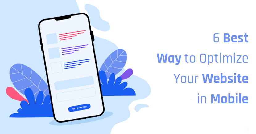
6 Best Ways to Optimize Your Website or Web Portal for Mobile Users
Mobile SEO is a process of optimizing your website or web portal to ensure that your site looks great and functions properly on mobile devices. We discuss 6 best ways to optimize your website or web portal for Mobile Users.
Today, most professionals and even common people use their smartphones as their sole computers to fulfill their daily needs. They use smartphones for checking emails, messages, food ordering, money transfers, sharing information,and much more.
In this list, people have also started exploring all types of websites through mobile phones, so it is mandatory to optimize your website for mobile devices as well.
According to research, it is said that mobile phone users are more in number than computer users. So, to increase the traffic for your website, it has to be optimized for mobile phones, tablets, and other intelligent devices. In this particular article, we have listed down some essential points to make your website mobile-friendly.
6 Ways to optimize Your Website or Web Portal for Mobile
1. Smooth and Seamless Mobile Experience
Even though the responsive design of websites has made many websites work well on all the devices, it lags in performance. So, to make your web portal perform well even on small devices, it is necessary to build a robust website that optimizes and performs well on all the devices.
It is necessary to check your website before optimizing it, as sometimes your website must be optimized by default.So, to better check your website, you can use Google mobile-friendly tests and it will allow you to find whether the website is mobile-friendly or not.
Using a google mobile-friendly test is very easy. You just have to paste the URL in the box and click on the verify button so that your website will be checked for compatibility automatically. If your website is not mobile-friendly, then you can follow the mentioned steps in this article to make your website mobile-friendly.
2. Ask for Feedback from Customers
The primary step in turning your site mobile-friendly is asking for feedback from your customers who use the website for a long time. You may think that the website that you have created has fulfilled all the needs of the customers.
However, the fact is that they may face some issues.And if someone asks for feedback, they will tell the actual reality. They will let you know the part in which your website needs to be improved. By getting feedback from many clients, you can enhance and augment your web portal.
Another way for optimizing websites for mobile users can be done by using their own website through mobile phones. By doing this website, the owners can find the mistakes easily and can change the design accordingly. Pages that are completely visible on computers may need to scroll in mobile phones for a long time to view that page altogether.
3. Create a Separate Design for Mobile Site
For creating a design for mobile, you can first prioritize things because mobile phones are vertical, and if they are projected in the way that is developed for desktops, then the information will not be visible for all the users. So, giving priority to information is the key to having a good website design for mobile.
In the same way, desktop designs may have a lot of color and design to attract customers, but mobile phones cannot display all the designs and images that are developed for a desktop, so content needs to be projected in the right way to make your website popular. Optimizing your web portal for a seamless mobile experience can be executed by giving importance to content.
Another important factor while developing a website for your mobile is that it must have clear navigation. In mobile phones, it is hard to find a way to get into the home screen because people may be lost into a page where they can’t find a way to reach the previous page, which may lead to the exit of the complete website so to avoid this all the websites must be planned and designed to have clear navigation.
4. Upload Content that Suits to All Mobile Devices
Mobile design of websites must have images and videos that can be viewed on all the mobiles and tablets. Some images and videos that are uploaded on desktop websites must have higher pixels, and those contents will have higher resolutions which smartphones and tablets will not have precisely.
So, to have a clear view of mobile versions and tablets, it is necessary to have a separate style of content for mobile phone websites and desktop websites.
File size may also affect the quality, so compressing the file to fit mobiles phones and tablets can also be done to have a clear website view in mobile phones and tablets.
5. Customize Your Designs to Make them Fit for Mobile Phones
For making your mobile phone website reliable, it is necessary to customize designs to fit smaller sizes. So, if you are developing a mobile website, the designs that you use must be unique, and they must be visible to all the users to make your website popular.
According to research, it is said that a product that is not presented well has higher possibilities for rejection among the users, so present your website simply and neatly so that even a one-time visitor can have a good impression on your website. You can approach experienced app development companies to customize your design.
6. Improve the Site Loading Time
It has two types of loading, namely preloading and lazy loading. Preloading is the type that is completely dependent on the type of processor, browser, and the network speed the user has other than this if the website is good and if the user has the best version of all the above-mentioned things, then your site will load automatically.
Preloading will load the whole content. Whereas in lazy loading, it will load only the content which is already viewed, and if the user needs to load the whole page, then it is necessary to view all the content that is listed on the site.
Key Takeaways
We have listed some ways to optimize your website for mobile devices. You can connect with one of the best mobile app development companies by following the above steps and develop a proficient web portal intended for mobile users. We hope this article has provided useful insights on developing websites for mobile users.
We hope you have found this article helpful. Let us know your questions or feedback if any through the comment section in below. You can subscribe our newsletter and get notified when we publish new articles for free. Moreover, you can explore here other interested articles.
Icon made by Designed by pch.vector
If you like our article, please consider buying a coffee for us.
Thanks for your support!
 Buy me a coffee!
The article you shared is very informative, and I am sure it will benefit many others as well. Thanks for sharing.