Bootstrap Vertical Form, Horizontal Form, and Inline Form Example
Bootstrap form layout vertical form, horizontal form, and inline form will be discussed in this article. Forms are an essential part of almost every website to collect user input data. In this article, we will learn how to create a form using the Bootstrap CSS framework. We are cover both Bootstrap 3 and bootstrap 4 forms layout.
Bootstrap 4 Form Layouts
Bootstrap provides two types of form layouts. Moreover, you can create a horizontal layout using Bootstrap 4 helper class:
Bootstrap 3 Form Layouts
Bootstrap provides three types of form layouts:
- Vertical form (this is the default)
- Horizontal form
- Inline form
Bootstrap 4 Form Layouts
All form elements are automatically inherited global styling of Bootstrap. Default, all user input elements likes <input>, <textarea>, and <select> with class form-controlhave a width of 100%.
Let’s see details to all form layout examples.
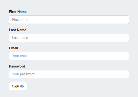
1. Bootstrap 4 Stacked Form
Use form-group class in wrapper element and each form elements add .form-control class to create stacked structure.
<form action="#">
    <div class="form-group">
        <label for="fname" class="control-label">First Name</label>
        <input type="text" class="form-control" id="fname" placeholder="First name">
    </div>
    <div class="form-group">
        <label for="lname" class="control-label">Last Name</label>
        <input type="text" class="form-control" id="lname" placeholder="Last name">
    </div>
    <div class="form-group">
        <label for="email" class="control-label">Email</label>
        <input type="email" class="form-control" id="email" placeholder="Your email">
    </div>
    <div class="form-group">
        <label for="password" class="control-label">Password</label>
        <input type="email" class="form-control" id="password" placeholder="Your password">
    </div>
    <button type="submit" class="btn btn-primary">Sign up</button>
</form>
Here is the output of the above code,
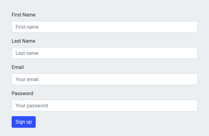
You can check the Bootstrap stacked form Demo and Download.
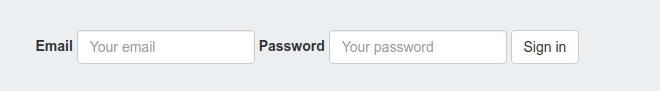
2. Bootstrap 4 Inline form
To create inline form add form-inline class to the <form> element. Moreover, all form elements are left-aligned with screen view-ports at least 576px wide. Below 576px screen, it will be stacked automatically.
<form class="form-inline" action="#">
    <label for="email">Email</label>
    <input type="email" class="form-control" id="email" placeholder="Your email">
    <label for="password">Password</label>
    <input type="text" class="form-control" id="password" placeholder="Your password">
    <button type="submit" class="btn btn-primary">Sign in</button>
</form>
Here is the output of the above code,
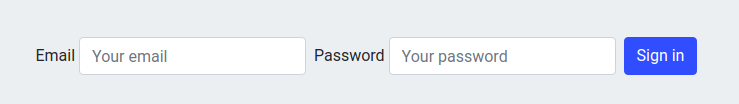
You can check the Bootstrap inline form Demo and Download.
3. Bootstrap 4 Horizontal Form
All labels and form controls use col-md-* to make a two-column horizontal layout. And it will wrap between between form-group and row class <div> container. All labels and input fields are left-aligned in single row.
<form action="#">
    <div class="form-group row">
        <label for="fname" class="control-label col-sm-2">First Name</label>
        <div class="col-sm-10">
          <input type="text" class="form-control" id="fname" placeholder="First name">
        </div>
    </div>
    <div class="form-group row">
        <label for="lname" class="control-label col-sm-2">Last Name</label>
        <div class="col-sm-10">
          <input type="text" class="form-control" id="lname" placeholder="Last name">
        </div>
    </div>
    <div class="form-group row">
        <label for="email" class="control-label col-sm-2">Email</label>
        <div class="col-sm-10">
         <input type="email" class="form-control" id="email" placeholder="Your email">
        </div>
    </div>
    <div class="form-group row">
        <label for="password" class="control-label col-sm-2">Password</label>
        <div class="col-sm-10">
         <input type="email" class="form-control" id="password" placeholder="Your password">
        </div>
    </div>
    <div class="form-group row">
        <div class="offset-sm-2 col-sm-10 pull-right">
            <button type="submit" class="btn btn-primary">Sign up</button>
        </div>
    </div>
</form>
Here is the output of the above code,
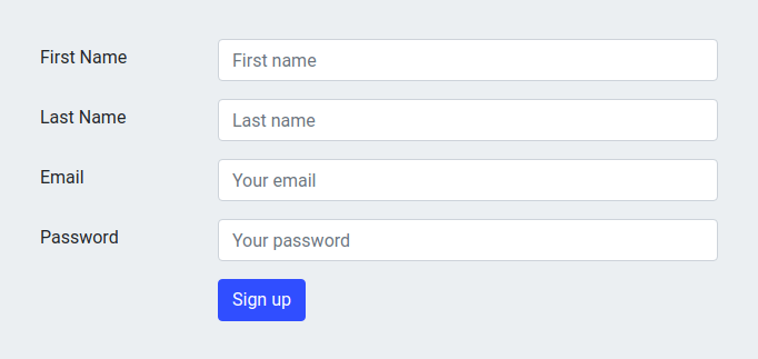
You can check the Bootstrap horizontal form Demo and Download.
Bootstrap 3 Form Layouts
Some common bootstrap 3 classes will apply on below three types of form layouts.
- All labels and form controls will wrap between
form-groupclass<div>container. - Form input elements will have
form-controlclass. - Use
<form role="form">, that helps to improve accessibility for the reader.
Let us see details to all form layout examples.
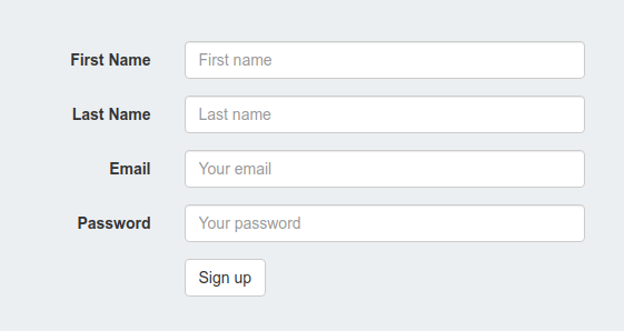
1. Bootstrap 3 Vertical form
This is the default Bootstrap form layout in which all input fields and labels are vertically aligned. There is no need any extra Bootstrap class applied on form and their child elements. Let’s create a simple Vertical form layout.
<form class="col-md-offset-3 col-md-6" action="#">
    <div class="form-group">
        <label for="fname" class="control-label">First Name</label>
        <input type="text" class="form-control" id="fname" placeholder="First name">
    </div>
    <div class="form-group">
        <label for="lname" class="control-label">Last Name</label>
        <input type="text" class="form-control" id="lname" placeholder="Last name">
    </div>
    <div class="form-group">
        <label for="email" class="control-label">Email</label>
        <input type="email" class="form-control" id="email" placeholder="Your email">
    </div>
    <div class="form-group">
        <label for="password" class="control-label">Password</label>
        <input type="email" class="form-control" id="password" placeholder="Your password">
    </div>
    <button type="submit" class="btn btn-default">Sign up</button>
</form>
Here is the output of the above code,
You can check the Bootstrap vertical form Demo and Download.
2. Bootstrap 3 Horizontal Form
To create a horizontal form, all labels and input fields are left-aligned in a single row. Only you need to add a form-horizontal class in <form> element. And all labels and form controls use col-md-* to make a two-column horizontal layout. Quickly check the horizontal form layout.
<form class="col-md-offset-3 col-md-6" action="#">
    <div class="form-group">
        <label for="fname" class="control-label">First Name</label>
        <input type="text" class="form-control" id="fname" placeholder="First name">
    </div>
    <div class="form-group">
        <label for="lname" class="control-label">Last Name</label>
        <input type="text" class="form-control" id="lname" placeholder="Last name">
    </div>
    <div class="form-group">
        <label for="email" class="control-label">Email</label>
        <input type="email" class="form-control" id="email" placeholder="Your email">
    </div>
    <div class="form-group">
        <label for="password" class="control-label">Password</label>
        <input type="email" class="form-control" id="password" placeholder="Your password">
    </div>
    <button type="submit" class="btn btn-default">Sign up</button>
</form>
Here is the output of the above code,
You can check the Bootstrap horizontal form Demo and Download.
3. Bootstrap 3 Inline Form
All form elements are left-aligned with screen view-ports at least 768px wide to applies. You need to add additional class form-inline to the <form> element. Let’s see the Bootstrap 3 inline form layout.
<form class="form-inline col-md-offset-2 col-md-7" action="#">
    <div class="form-group">
        <label for="email">Email</label>
        <input type="email" class="form-control" id="email" placeholder="Your email">
    </div>
    <div class="form-group">
        <label for="password">Password</label>
        <input type="text" class="form-control" id="password" placeholder="Your password">
    </div>
    <button type="submit" class="btn btn-default">Sign in</button>
</form>
Here is the output of the above code,
You can check the Bootstrap inline-form Demo and Download.
Notes:
1. Bootstrap control-label and form-control classes are used to style the labels and form elements respectively.
2. To control the textbox sizes you can use input-lg and input-sm classes.
We hope you have found this article helpful. Let us know your questions or feedback if any through the comment section in below. You can subscribe our newsletter and get notified when we publish new WordPress articles for free. Moreover, you can explore here other interesting articles.
If you like our article, please consider buying a coffee for us.
Thanks for your support!
 Buy me a coffee!
Join the Discussion.